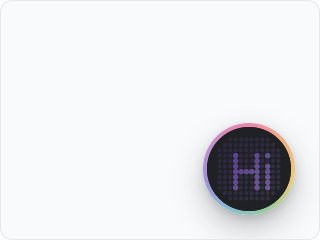
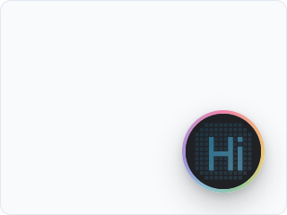
The Coworkkit button is a dot-matrix circle: a field of dots that animate as the agent listens and speaks. It is the product's visual mark, and it is the same mark in every app that embeds Coworkkit. You can tint it to your brand and pick the dot style. You cannot restyle the animated rainbow ring around it or the glow along the page edge. Those stay fixed on purpose, so a Coworkkit surface always reads as one, wherever it shows up.
Faces
The button comes in a few faces — different shapes for the same co-worker, each carrying the whole feature set (the controls, captions, the confirm card, status messages) and its own take on the brand mark. At rest every face shows the word Talk, in its own material, so a first-time visitor knows it is for talking. Pick one on the Appearance tab, above dot shape:
- Dots — the dot-matrix circle, Coworkkit's original face. A field of dots that spell Talk at rest and animate as the agent listens and speaks. This is the default.
- Island — a capsule that grows with the session. At rest it shows the word Talk and a small spectrum; while you're talking, the controls sit inline inside it and fold away until you reach for them; a confirmation unfolds the capsule in place into the card.
- Nebula — a glass orb with the rainbow drifting inside it, no rim. A light sweeps the glass while it connects, the hues turn violet and orbit while it thinks, and speech blooms out through the edge. The controls tuck under the orb.
- Monoline — a minimal disc in your app's own colours (light or dark, it follows the page). One hairline draws the session — a flat line at rest, a waveform while you speak, an ellipsis while it thinks — and the rainbow shows only as a thin rim that brightens when you talk.
- Aura — the smallest button of the set: a presence dot with a soft rainbow glow behind it. The glow breathes while it listens, spins while it connects, swirls while it thinks and blooms with speech; the controls float above the dot when you reach for them.
A face is central data, like the dot shape and the accent — pick it in the portal and it changes on your users' next page load, no redeploy. New faces ship in the SDK, so a face needs @coworkkit/react ≥ 0.2 (the portal says so on the card). Each face expresses the brand mark itself — the spinning rim here, a different treatment there — and no setting recolors or restyles that mark.
Your saved look applies automatically
You don't need to wire anything for your saved look. The look you pick on the Appearance tab rides the session your backend mints, so it applies to every app on this coworker's key — no look prop to paste. The SDK remembers it in the browser, so a returning visitor sees it from the first frame, before they click.
The one thing to know: on a brand-new browser, the very first paint — before its first session — shows the default look, because the browser learns which tenant it belongs to only from the session it mints (nothing identifies your tenant to the browser ahead of time). From the second visit on, it paints your saved look immediately.
The look prop (optional)
look on CoworkkitProvider is now an optional pin, not a required step: your saved look applies automatically after the first session; pass look only to pin a specific app to one look, or to override during development. It takes either a look code (the short pointer from the Appearance tab) or an inline LookSpec object, and it always wins over the saved default.
A look code is resolved at runtime from a public, cosmetics-only endpoint, so the actual dot shape and accent live in the portal, not baked into your bundle:
// Optional — pin an app to a specific look code. Resolved at runtime.
<CoworkkitProvider look="amber-fox-7f" getToken={getToken}>
  {children}
</CoworkkitProvider>
The inline object is the dev path: applied directly, no network round-trip, handy while you are dialing in a color.
// An inline LookSpec, applied immediately, no portal round-trip.
<CoworkkitProvider look={{ dotShape: "square", accentColor: "#7c3aed" }} getToken={getToken}>
  {children}
</CoworkkitProvider>
What you can change
A short, cosmetics-only object:
type LookSpec = {
  face?: "dots" | "island" | "nebula" | "monoline" | "aura"; // which button face to render (default: dots)
  dotShape?: "circle" | "square"; // round dots (default) or square — dots face only
  accentColor?: string; // any CSS color; tints the audio-reactive element + active controls
};face: which button face to render —dots(the default) orisland. See Faces above.dotShape: round dots (the default) or square. It changes how the dot field is drawn; the animation and layout are unchanged. It applies to the dots face only.accentColor: any CSS color. It tints the lit dots and the active control buttons (mic, hand, and the rest, once engaged). Leave it off to keep the default accent.
Everything else (the rainbow ring, the page-edge presence glow, the sizing and motion) is the brand mark and is not themeable. Customization is bounded by it by design.
From the portal, without a redeploy
To ship a branded button without touching your code:
- Open your Coworker in the portal and go to the Appearance tab.
- Pick a face, dot shape, and accent; the preview updates live as you change them.
- Save. That's it — the look applies to every app on this coworker's key on its next session. (The tab also shows the code, if you want to pin an app to it.)
The saved look is a live pointer, not a snapshot. Edit it in the portal and it updates on your users' next session, with no redeploy. The SDK applies the last resolved look instantly and revalidates fresh in the background, so a saved change propagates on its own.
Cosmetics only
The look channel is cosmetics-only by construction: the SDK keeps only dotShape and accentColor from the endpoint's response and discards every other field. No key, provider, or transport can ride this path, the same closed-loop rule that governs the rest of the SDK. If the look ever fails to resolve (offline, a bad code, a blocked request), the button silently falls back to its default and carries on.